BART

Role
Lead Visual Designer/Art Director
Client
Bay Area Rapid Transit
Agency
Project type
Integrated Marketing Campaign
Project overview
Bay Area Rapid Transit is to the Bay Area like the the subway is to NYC. Everyone uses BART for something at some time. They came to the agency looking to increase ridership during non-peak hours and weekends.
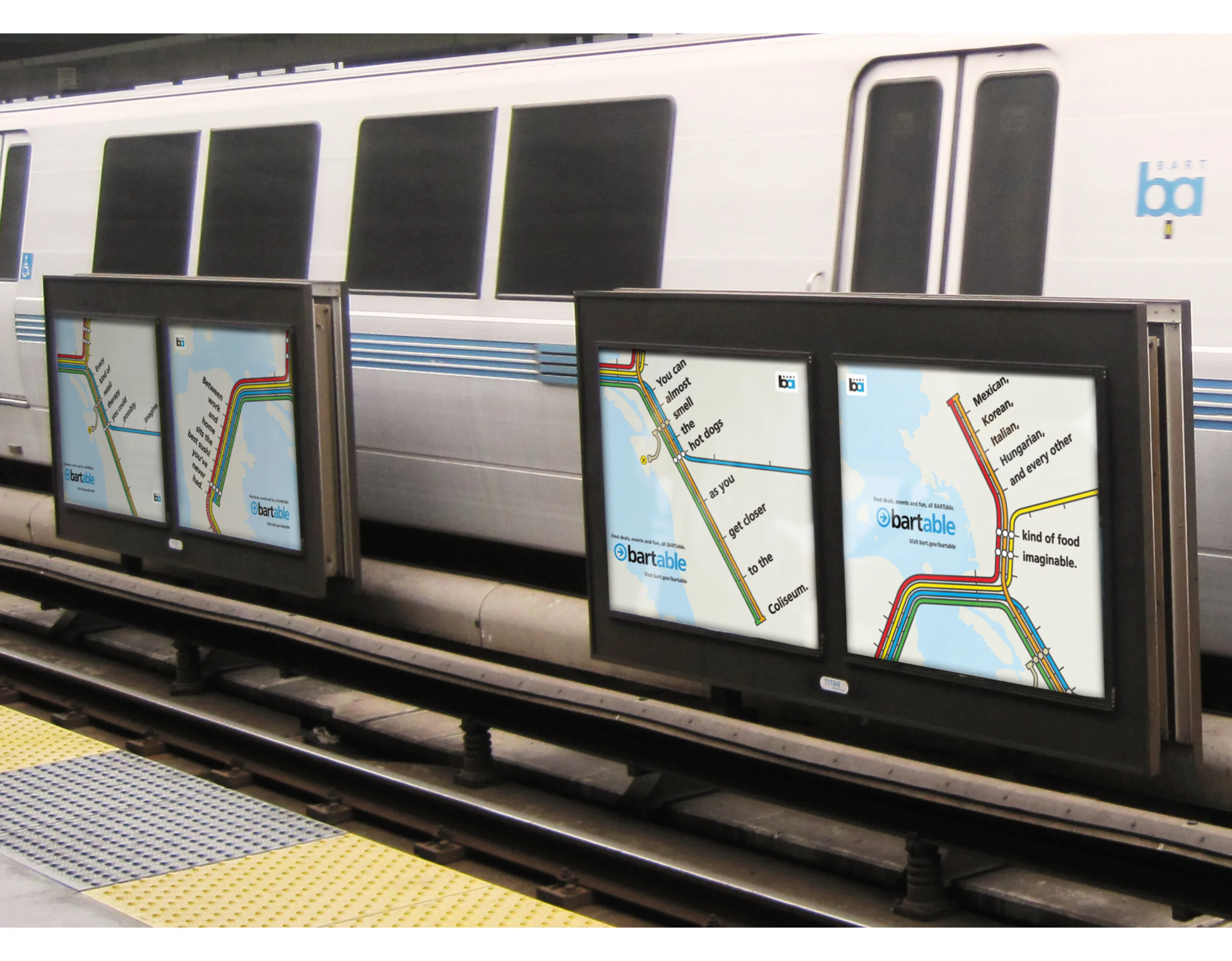
First, we focused on co-opting a phrase that's commonplace around here: "bartable." If you can take BART to it, it's bartable. The campaign ran in trains, throughout stations and had two TV commercials made that ran for over 4 years.
Once we co-opted the phrase, we took over another iconic BART symbol—the map. Commuters were used to seeing the BART map in the stations and on the trains, so we took something familiar and reinvented it to show just how many things there are to do all along the BART line.
The challenge
Encourage BART ridership outside peak commuting hours and on weekends.
My contribution
Lead visual design and art direction with Division of Labor.
The work delivered
An integrated campaign built around “bartable,” appearing on trains and in stations, with two television commercials that ran for more than four years.